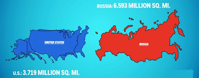
This is a video if you click the button below these lines that compares the size of countries around the world. It gives a new perspective on the shape and size of the world. click word button right below these words:
Animated maps put some things in perspective
Monaco's tiny size and Africa's enormity are seen on a different scale in a quick tutorial.
How U.S. compares to Russia »
No comments:
Post a Comment